Why has the RAD refreshed its brand now?
Susi Pink, RAD Associate Director, Marketing & Communications We felt the brand needed a refresh in line with the new five-year strategy for the RAD that Tim Arthur, the CEO, has created. We want to build on the legacy of the past, but look to the future – to become transformative and innovative, positioning ourselves in the dance sector as an organisation to support what we and our teachers do, and what everybody who dances with the RAD enjoys. It’s not a complete rebrand, more of a refresh.
The market place for dance and teaching dance is changing. Dance and dance teachers have to compete with multiple other activities for children, so it’s important to have a good brand that appeals not just to us and our teachers, but to parents and students. We need to create a brand that supports our teachers in building successful dance schools and businesses.
What ideas and emotions do you hope the brand will convey?
Pink We worked with the design agency Ninepoint. We wanted to build on what we have, but bring in more joy and exuberance, a bit more about dance and how it makes you feel. It’s not just a logo, it’s about our values.
Rachal Watson, Ninepoint We wanted to create an honest interpretation of where the RAD is now, and where they want to be in future. The job was made a lot easier for us because they were so clear on their strategy. We had a lightbulb moment when all the department leads were gathered together in one room to share their story and perspective. They talked about inclusivity, togetherness, joy – that was very much our starting point.
The iterations that we then presented went from evolution through to revolution. I was blown away by how bold Tim wanted to be. I loved talking to the team, and seeing their excitement, their sense of pride and ownership. We hope the new brand feels like an honest and true reflection of who the RAD is.

How do you balance heritage and forward thinking?
Watson We want to retain the recognisable elements, but also branch into a new world. We needed to find the balance. We took inspiration from the RAD’s coat of arms – it is very delicately crafted, but with a modernity in the brushstrokes. We’re taking the old and pushing it into the new. With the elements that we’ve created, you can be formal or lean into something exuberant or joyful.
Pink We love our coat of arms, it’s an important part of our brand that we don’t want to lose. Although ballet is an important part of our heritage and history, we also want to expand into other dance genres. This feels like a natural evolution.
What was the thinking behind the new logo, font and colours?
Pink The simplified primary logo is now on two lines rather than three, so it’s more flexible as a design element. It can also work on one line, for example on merchandise. It’s very classic and elegant, but with a modern, fresh feel. Our RAD red is a massive part of who we are, but we’ve brought in some additional colours – fresh pinks, oranges, yellows, and magenta – to give an extra pop and sizzle.
Watson The font actually harks back to the 1920s and 30s. The flourish marks allow a more expressive formation – as if they’re conveying the dance process.
How did you arrive at the RAD’s new ‘R’ symbol?
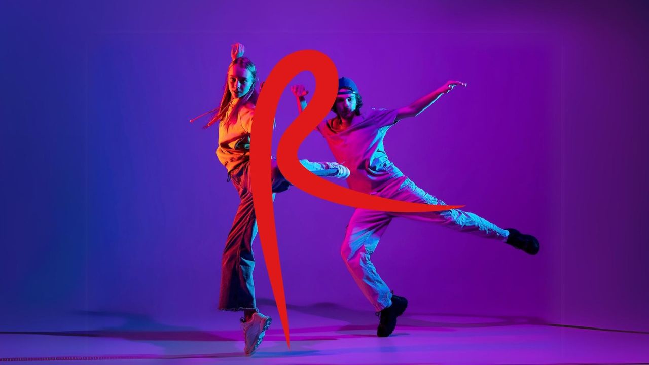
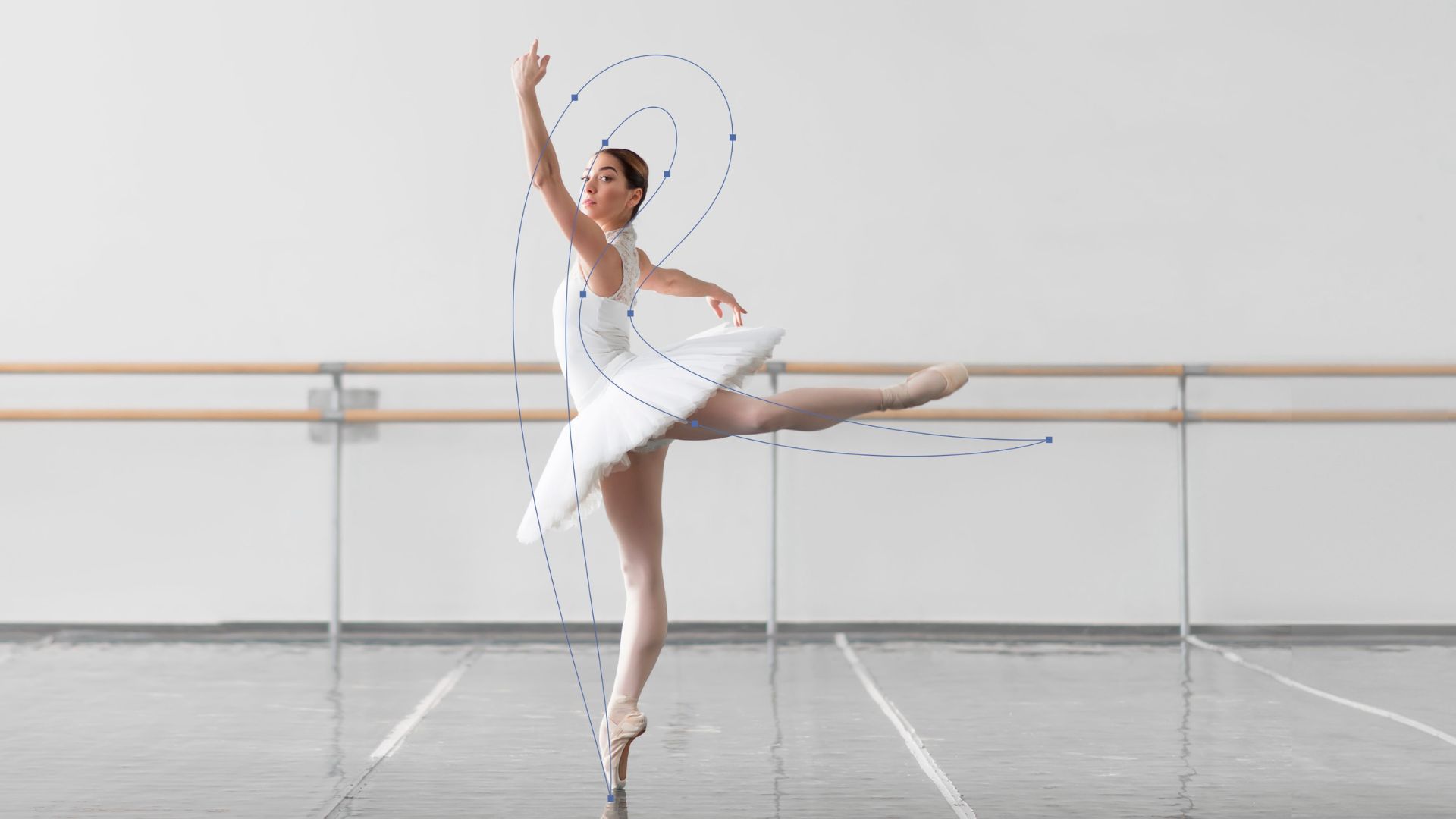
Watson The RAD wanted a visual shorthand to sum up what dance means to us all. We wanted to find a mark that summed up the joyful act of movement and which was genderless, raceless, ageless. It can be used for dramatic effect or as a visual sign off. There were many iterations, with great big, messy mood boards! We called it the arabesque dancer, but need to find a better term for this instantly recognisable little mark.
Pink We looked at movement shapes, both classical and contemporary. The ‘R’ can work in a lyrical dance context, and also with something more commercial like street dance. It’s very flexible, embracing our heritage and giving us a step into the future.
Sum up the new brand in three words?
Pink Joyful, dynamic, established.


